
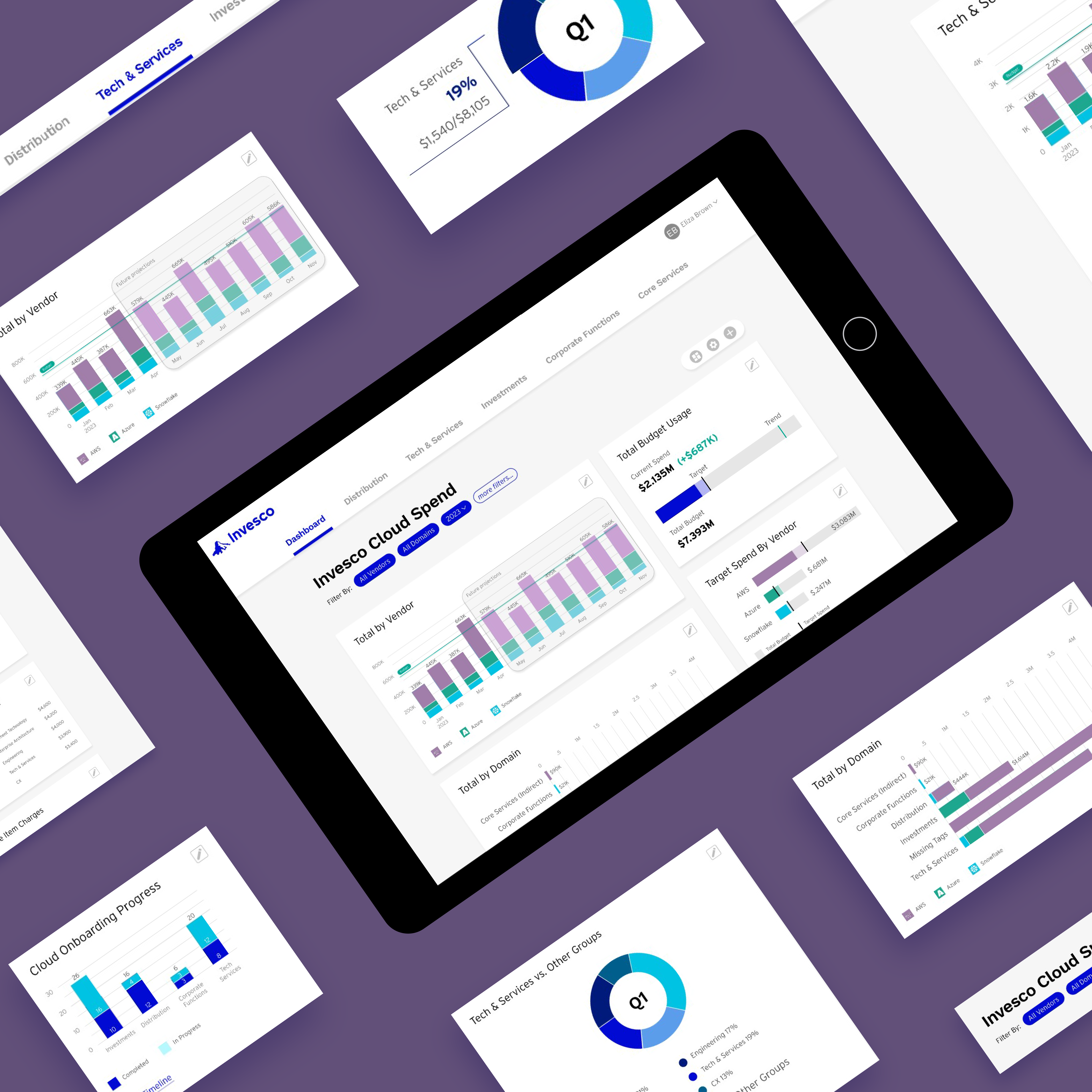
Invesco Cloud Usage Dashboard
The Publicis Sapient team designed and pitched a new product to the client in one week. The InvescoCFO requested an interactive dashboard to track the company's cloud spend. I led the UI design for adashboard concept that needed to be data-rich, scannable, and friendly while helping users makeimportant financial and technical decisions.
Role:
Lead UI designer
Team:
1 UX designer, 1 product manager
Tools:
Figma
Skills:
UI design, data visualization, prototyping
Timeline:
April 2023
Challenge
Design a comprehensive cloud spend dashboard and business unit-specific "utility bill" within anextremely compressed timeline of just one week.
Our dashboard needed to display trends and determine the business value of cloud spend for executive decision-making.
In addition to the high-level dashboard, we created a business unit-specific breakdown of cloud usage for the Tech and Services division of Invesco. Invesco asked us to take inspiration from utility bills with a graphic breakdown explaining cloud spending. The dashboard needed to be both data-rich and friendly; interactive and scannable. As with all dashboard designs, we needed to strike the right balance to sell our idea to the CFO.
Approach
Working closely with a UX designer, I focused on creating a friendly visual breakdown of cloud spend thatwould resonate with executive stakeholders. Our overall approach kept customization and scalability at the forefront of the design.
Key design principles:
01.
Card-based design for scalability and future feature expansion
02.
Customizable arrangement allowing users to personalize their dashboard
03.
Bite-snack-meal approach to data consumption with progressive disclosure
04.
Interactive elements that encourage exploration and deeper understanding
Solution
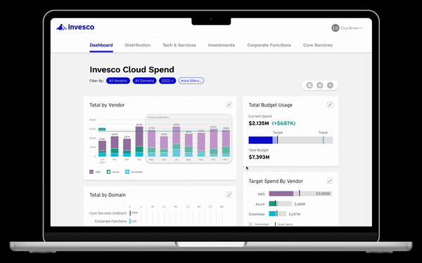
The final design leveraged interactive Figma prototyping to demonstrate how users could customize andinteract with their cloud spend data.
Core Features
Trend Visualization & AI Predictions
We included widgets to visualize trend data and AI predictions for future spend. Users can scan andcomprehend data trends at a glance, but also have the option to dive deeper into detailed analytics.
Flexible Data Views
The cloud onboarding progress widget illustrates how customizable the data visualization can be. Userscan toggle between bar graphs showing current state totals or timeline views showing progress overmonths, depending on their specific needs and priorities.
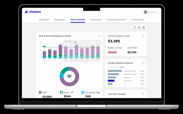
Utility Bill Breakdown
For the business unit-specific view, we created a utility bill-inspired interface that makes complex cloudspending data approachable and understandable.
We leveraged hover interactions to make charts more friendly, informative, and inviting. Users get thebigger picture at first glance and are encouraged to explore for more details through satisfying micro-interactions.
Interactive Prototype
I created a Figma prototype that demonstrated the dashboard's interactive capabilities during the client presentation.
The prototype showcased:
- Responsive hover states that reveal additional data context
- Customizable widget arrangements through drag-and-drop functionality
- Filter controls for focused data analysis
- Progressive disclosure patterns for complex financial data
Interact with the Figma prototype below to see the dashboard in action!
Presentation
The culmination of this work came with the client presentation to the Invesco CFO. I explained the importance of design principles while stressing the business value of the product and potential for future partnership.
Key Outcomes
- Successfully demonstrated design thinking approach to complex data visualization
- Showed scalable framework potential for future development
- Proved ability to deliver high-quality design work under extreme time constraints
- Established foundation for potential ongoing partnership with Invesco
Impact
With such a condensed timeline, it was crucial that we leverage key assumptions and best practices in dashboard design. While we had a lot of data to pull from, we had no access to primary users for research, so we kept things simple and defaulted to customizability.
Critical design decisions:
01.
Distilled complex information into easy-to-read charts for trend visualization
02.
Built in flexibility with filter controls, rearrangeable cards, and presentation options
03.
Prioritized framework potential over individual widget functionality due to sprint constraints
04.
Focused on scalable solutions that could grow with user needs
Skills Demonstrated
This sprint was a valuable experience for honing my data visualization and UI design skills in a fast-paced environment. I enjoyed having significant ownership over this project as one of two primary designers.
- Rapid prototyping under tight deadlines
- Executive-level presentation skills
- Complex data visualization design
- Stakeholder communication and design advocacy