Team: Project Lead, Lead UI Designer, 2 UX Designers, Subject Matter Expert, Lead Engineer
March 2022 - September 2022
- UX Design
- UI Design
- Usability Testing
- High-fidelity Prototyping
- Axure RP
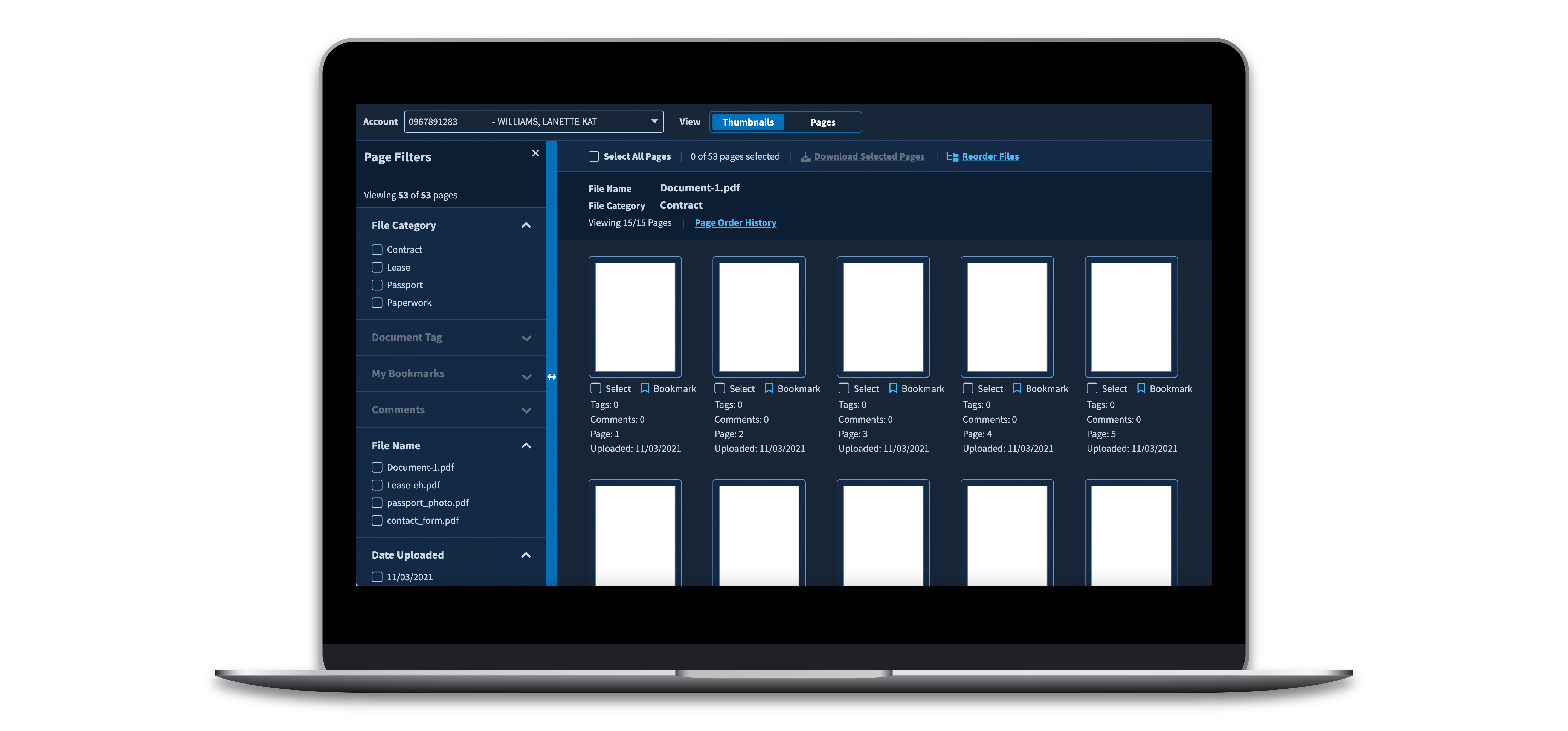
I was the primary UX designer for a high-priority redesign along with a team of five designers and two engineers. The product is a PDF viewer and editor that is integral to client case processing with thousands of internal users. This project included significant UX redesign, a complete UI update — including the creation of a dark mode design system — two rounds of usability testing, and integration of AI tagging to speed up officer workflows. The prototype is currently in development and features are being rolled out to users in 2023.
I was the primary UX designer for a high-priority redesign along with a team of five designers and two engineers. The product is a PDF viewer and editor that is integral to client case processing with thousands of internal users. This project included significant UX redesign, a complete UI update — including the creation of a dark mode design system — two rounds of usability testing, and integration of AI tagging to speed up officer workflows. The prototype is currently in development and features are being rolled out to users in 2023.
Challenge #1
The PDF viewer used unique UI and UX patterns unlike any other client product.
The old PDF viewer was difficult to learn and clunky for even the most experienced users. There were many usability issues, but many stemmed from a lack of familiarity and foundational understanding — the product was different from all other software officers use in their day-to-day. It used an entirely unique "design system" and unique UX patterns. Even the flow for leaving and editing comments was unique, despite a unified commenting flow in the client's official design system.
Users had a few requests: to keep dark mode because it is easier on the eyes and makes the white PDF pages stand out more, and to use more familiar language for navigation controls.
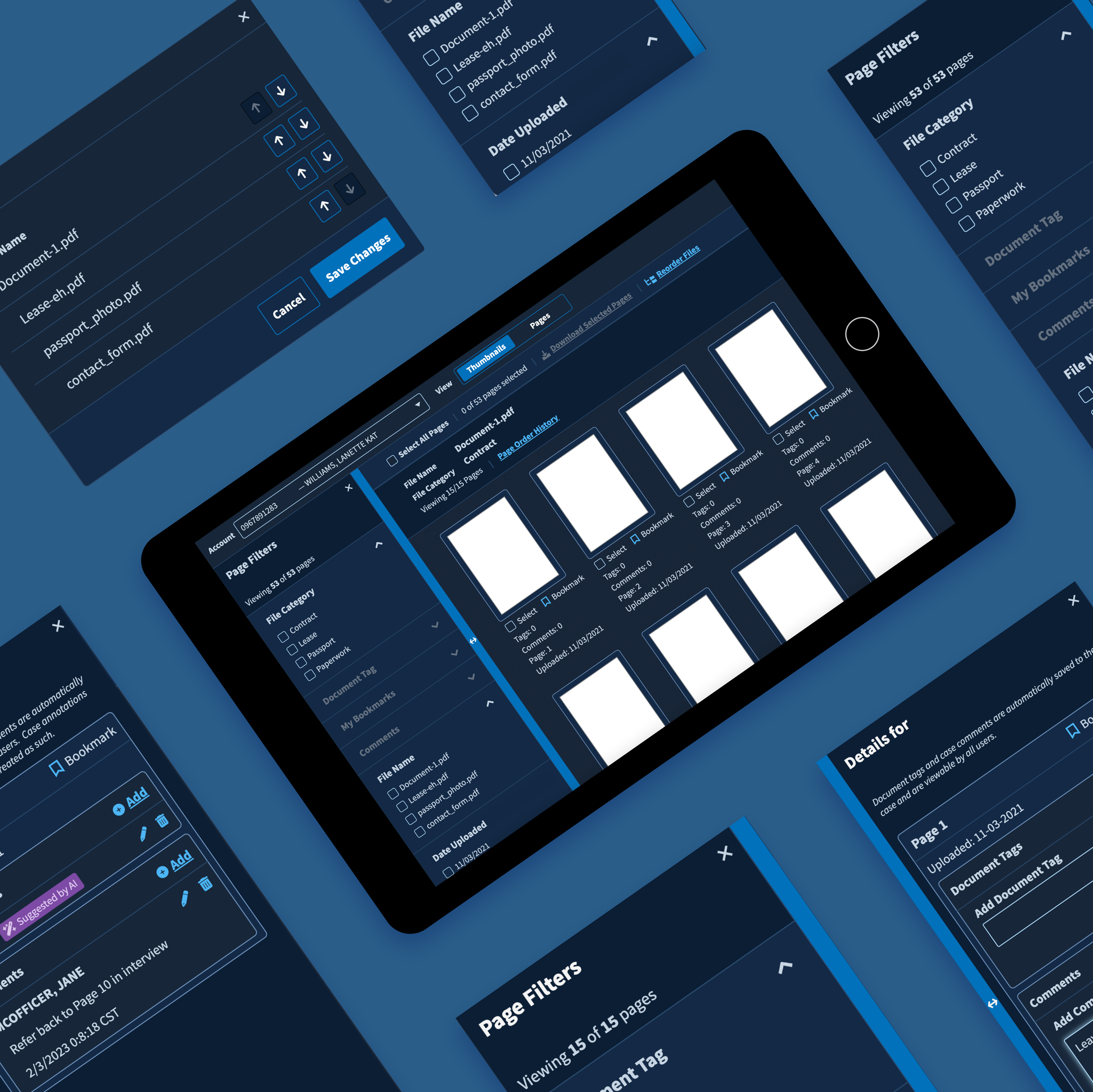
Dark Mode Design System with New Components: We created a dark mode and added new components and flows where necessary.
We created a dark mode version of the official design system, in compliance with Section 508 contrast requirements. In addition, we revised copy to better reflect officers' mental models of the system. The new UI received overwhelmingly positive feedback in usability sessions and users tested well on tasks.
For features unique to the PDF viewer, we created new components and added them to the design system. I wrote design specs and tracking metrics and worked closely with engineers to design comprehensive and scalable new components.
Challenge #2
The PDF viewer included AI and user-generated tags, but did not significantly improve users' productivity.
Users review, annotate, flag, and approve anywhere from 10 to 40 pages of documents at once. Some of these pages are tagged with the type of document, and these tags can either be user-generated or AI-generated. Users refer to specific pages of evidence multiple times and scroll back and forth between pages often. We discovered that users were not relying on tags — they were using comments instead. To utilize tags, users essentially had to scroll through the entire document. In addition, some users genuinely had no idea what tagging meant and could not tell the difference between user-generated and AI-generated tags. It was equally clunky to scroll through comments, but quickly typing comments was quicker than selecting tags, so users defaulted to using tags instead.
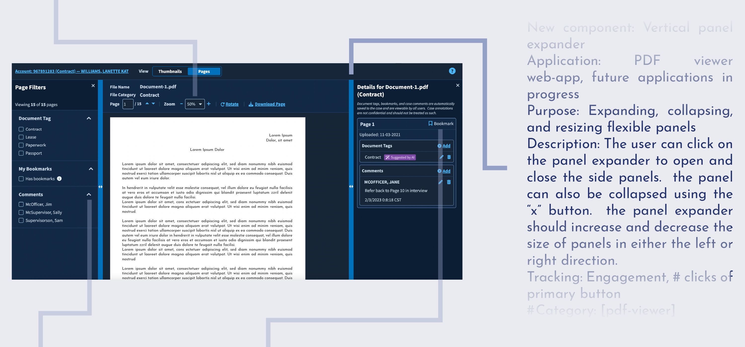
Human vs. Computer: We added support text to clearly define tags and streamlined the tagging flow.
The PDF viewer is one of the first, most visible applications of AI in the client's ecosystem, and we found that users did not understand when AI was utilized in discovery. Our team was working concurrently with other teams to put out more AI-dependent features in other products, and we wanted to establish a visual language to differentiate user-generated and AI-generated content across all the client's products. We created a designated "AI Purple" and tested language to describe the difference to users, which will scale to future AI projects.
In addition, we streamlined by eliminating an edit mode. Users no longer have to click into edit mode to add a tag — the "Add" button is always visible on the screen. We also added typeahead suggestions to avoid excess scrolling through tag options, since users must choose from a pre-determined list of tags.
Challenge #3
Near-future states will render an imperfect product unusable.
New cases being introduced in 2023 will put hundreds of pages of documents into single files — meaning the PDF viewer will go from ~50 pages at a time to multiple hundreds of pages in a file. Already, users waste time scrolling back and forth between pages of interest. Soon, that will suck up even more time and cause more frustration. The PDF viewer needed a navigation overhaul to address evolving requirements and hundreds more pages.
Tagging, Filters, and Comprehensible Thumbnails: We redesigned the navigation flows, controls, with built-in flexibility to accommodate user preferences.
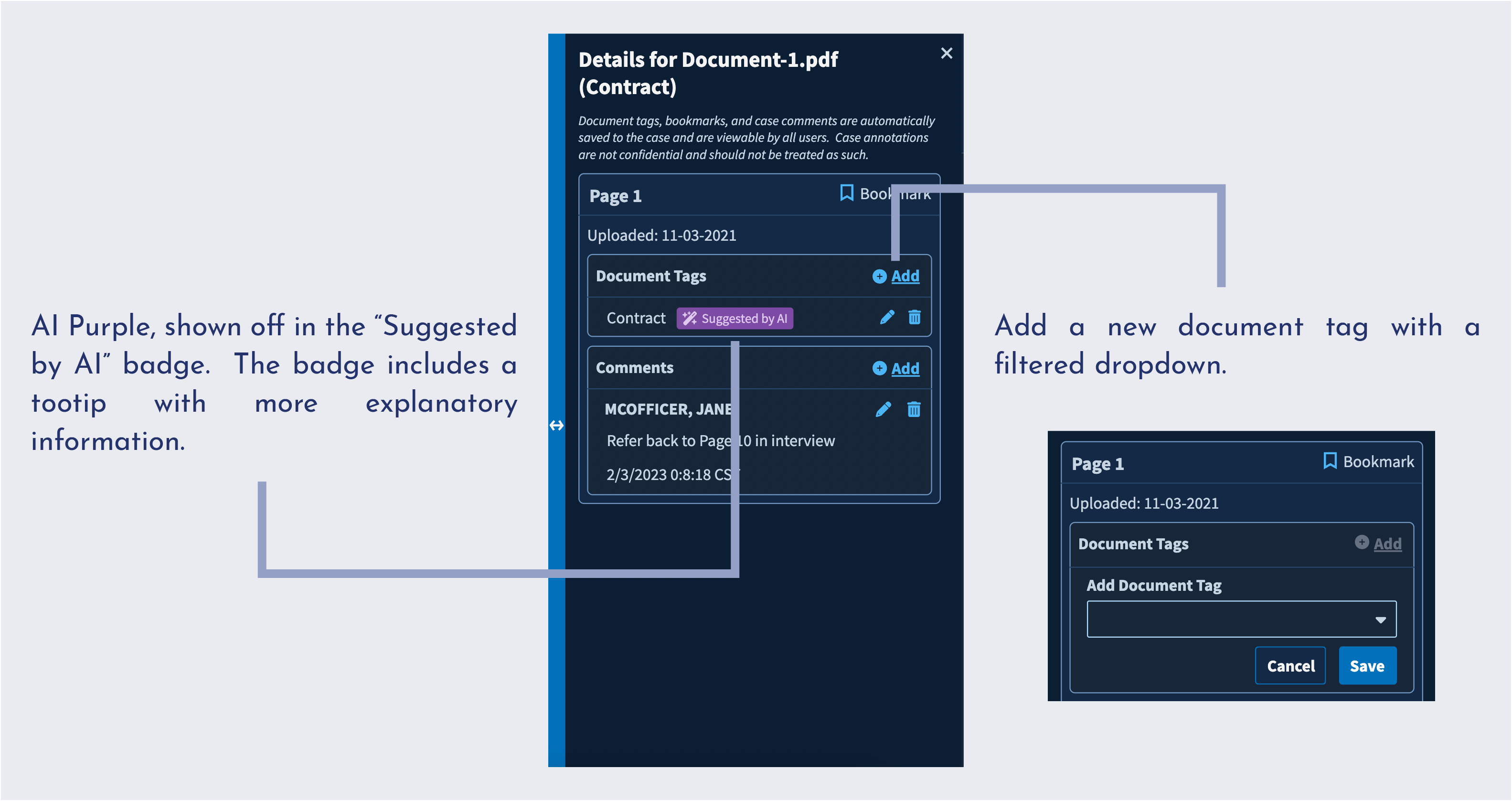
Pre-redo, many users relied on thumbnail previews to navigate to pages of interest within a file. However, with hundreds of pages, those thumbnails will start to visually blend together more and more. We added metadata to each thumbnail, including comment previews and tags to differentiate between thumbnails with annotations. We added a viewswitcher for users to toggle between the thumbnail view and larger page view, rather than keep thumbnails in a collapsible panel like before.
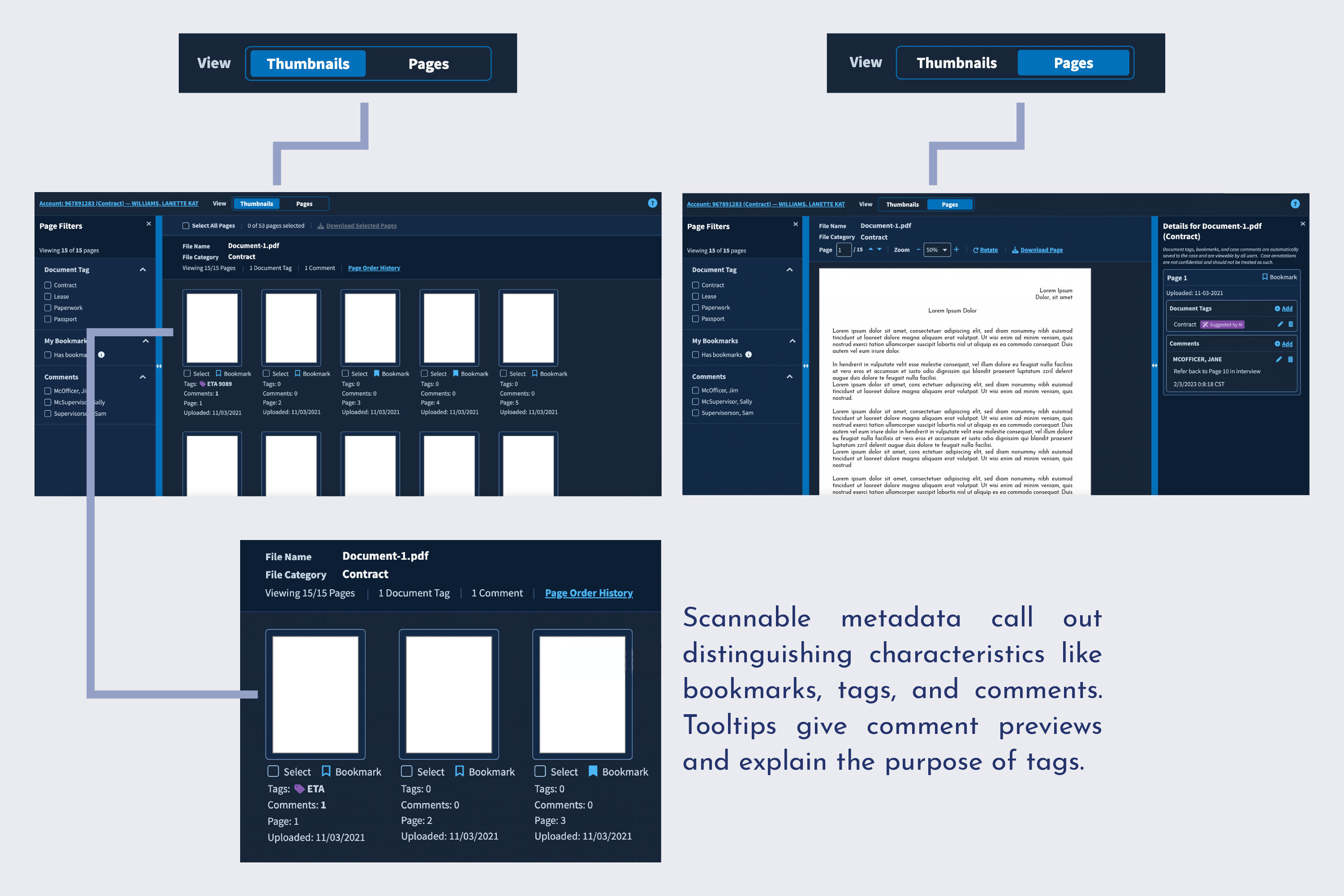
The biggest improvment to UX is the addition of filters. Filters apply to both pages and thumbnails and allow users to more quickly navigate to pages of interest. In addition, users can reduce visual clutter and overwhelming information by filtering out unrelated documents. Our team determined the list of applicable filters and tested the new workflow with users, who had overwhelmingly positive feedback on the improved navigation system. The visual presentation of the metadata used in filters also had to be reconfigured for visual consistency.
The biggest improvment to UX is the addition of filters. Filters apply to both pages and thumbnails and allow users to more quickly navigate to pages of interest. In addition, users can reduce visual clutter and overwhelming information by filtering out unrelated documents. Our team determined the list of applicable filters and tested the new workflow with users, who had overwhelmingly positive feedback on the improved navigation system. The visual presentation of the metadata used in filters also had to be reconfigured for visual consistency.
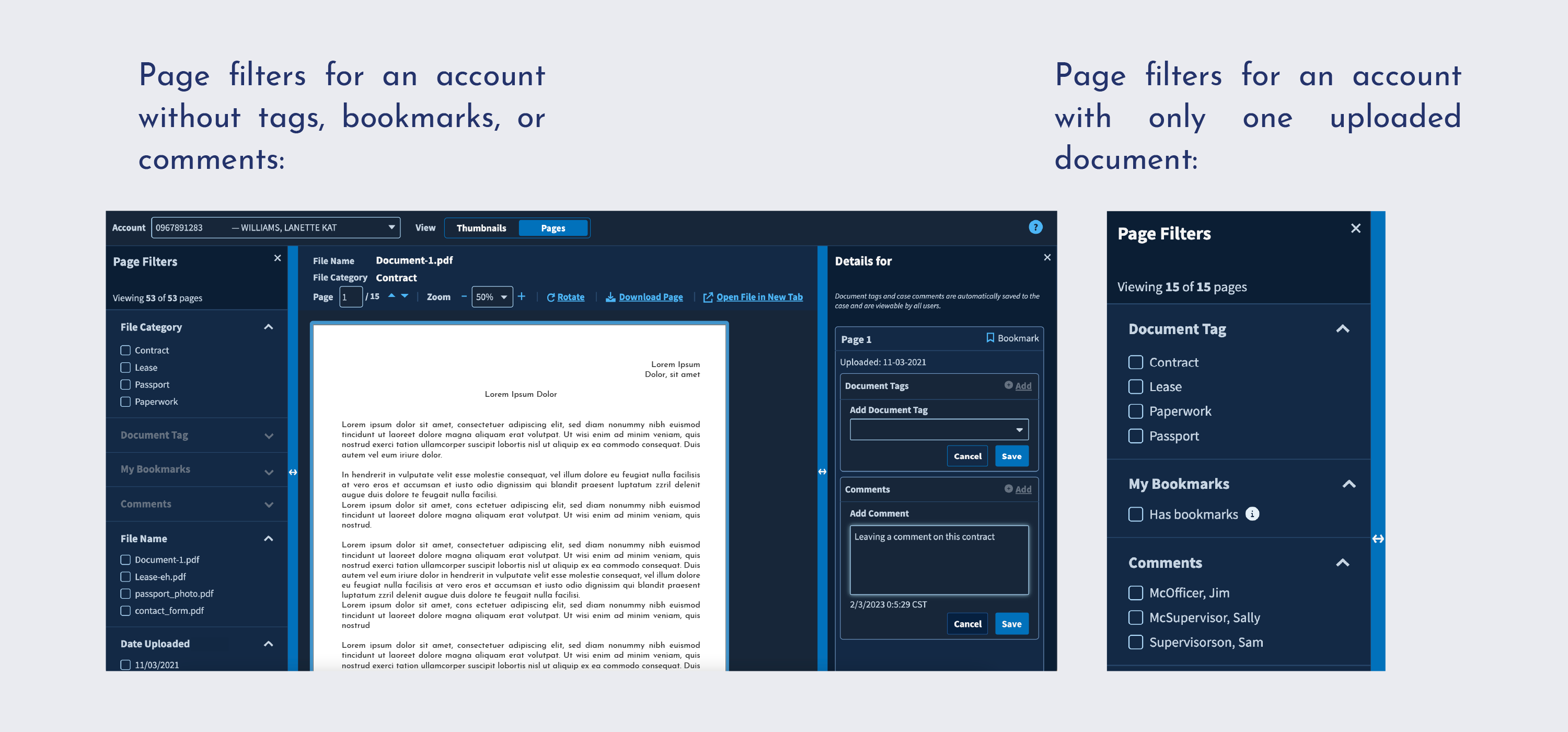
Users span multiple career levels with very different priorities. Some users scroll through each document page-by-page for cursory review, some flag pages of interest, and others go back and forth with their direct reports to reach conclusions about the documents. Each group has distinct preferences and workflows, which presented interesting design challenges and required our team to prioritize flexible workflows. While we added features like filters, we had to be mindful that some users will not utilize the features and will resent extra visual noise on their screens. We made the filters and annotation panels collapsible so that users can utilize as much screen space as they want, and kept the thumbnail navigation separate from the scrolling pages of documents to allow users to navigate in whatever way they wish.
We made significant changes to the UX to ensure that the product redesign would be scalable. These changes required collaboration between engineering, design, and stakeholders, as well as rigorous usability testing and accessibility checks. The final product is modernized, more visually appealling, and provides robust navigation features to address dramatically different requirements.
Leading the UX design for this project was a major responsibility and fantastic learning experience. Speaking with real users to learn about their day-to-day frustrations, pain points, and motivations was enlightening. I made impactful design decisions ranging from UI updates, to new feature specifications, to tagging taxonomy. Working with a team of experienced designers, engineers, and leaders was humbling and empowering. I presented work to the client in multiple contexts including brainstorming sessions, usability study recaps, and legal reviews and learned about advocating for design in consulting contexts. I mastered Axure prototyping techniques to create a complicated interactive prototype for user testing and prepared documentation and tracking metrics for development handoff.
And at the end of the day, I am confident that the new product will address real usability issues and scale to accommodate changing business interests.