Team: Project Lead, 2 UX Designers
November 2022 - February 2023
- UX Design
- UI Design
- High-fidelity Prototyping
- Leadership
- Axure RP
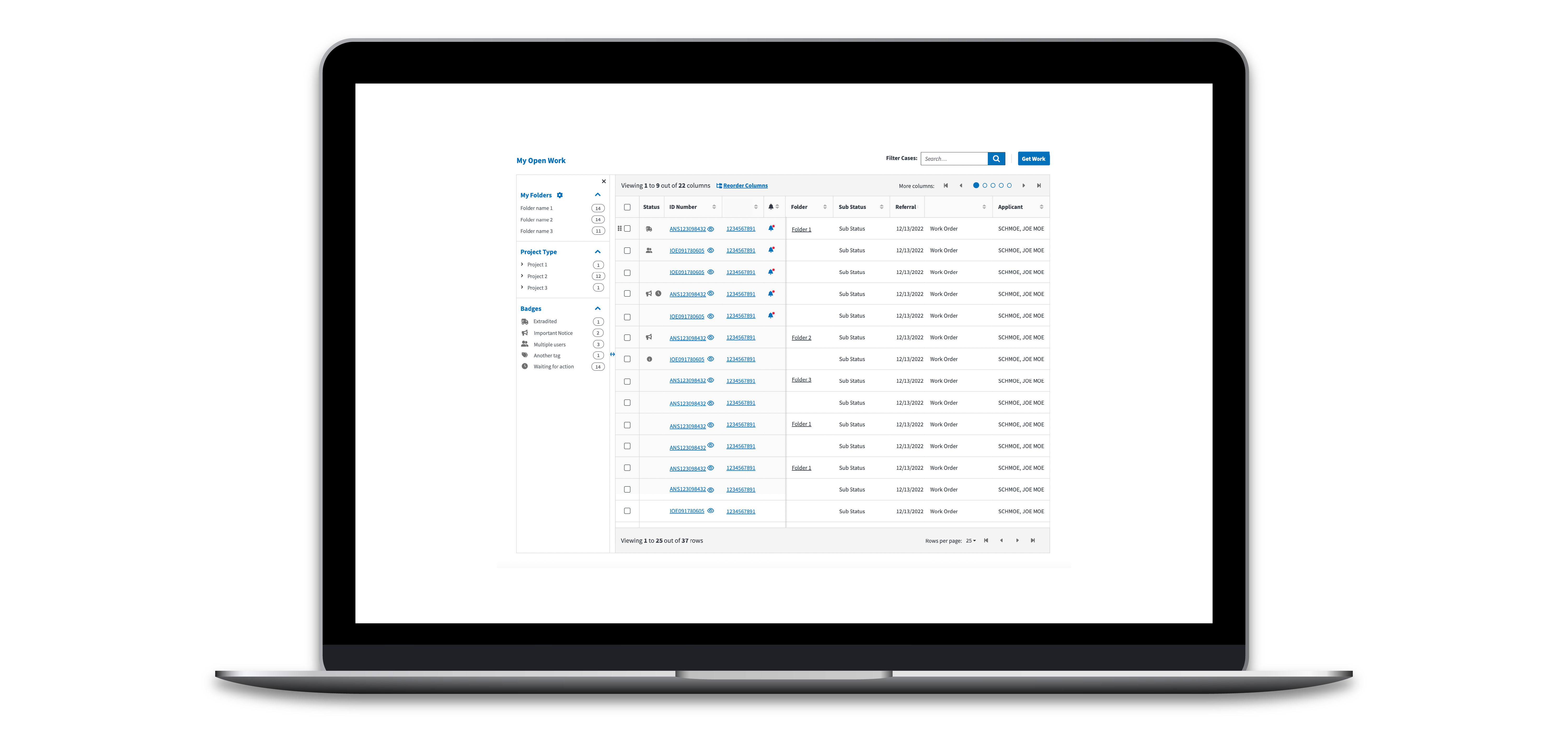
I led a team of three designers to create a revamp proposal for the client's internal homepage. All agents use this page to keep track of their cases and upcoming tasks, but the old version had several significant usability issues. The homepage is a large, unresponsive table with tens to hundreds of rows of data, and too many columns to display on the page all at once. Our proposal tackles the thorny issue of responsive enterprise tables (no small task!), while recognizing the familiarity of the well-established workflow and development limitations prevent a full redesign. The proposed design will impact thousands of users at every step in their workflow. The design is undergoing developer reviews and usability studies in 2023.
I led a team of three designers to create a revamp proposal for the client's internal homepage. All agents use this page to keep track of their cases and upcoming tasks, but the old version had several significant usability issues. The homepage is a large, unresponsive table with tens to hundreds of rows of data, and too many columns to display on the page all at once. Our proposal tackles the thorny issue of responsive enterprise tables (no small task!), while recognizing the familiarity of the well-established workflow and development limitations prevent a full redesign. The proposed design will impact thousands of users at every step in their workflow. The design is undergoing developer reviews and usability studies in 2023.
The old design was certainly not mobile-first — or even mobile-friendly, for that matter. All the information on the page is contained within a large table with tens if not hundreds of rows. The user could choose up to seven columns of data points to view at a single time, and the rest of the columns were hidden from view. Users are not permitted to use their smartphones to view the page, but the table broke even at tablet sizes. Some of our users do use smaller laptops to do their work in the field, and most officers are adamant that they need the flexibility to resize their windows.
Some users were frustrated enough with this table that they devised workarounds to avoid encountering it. This homepage couldn't be less homey.
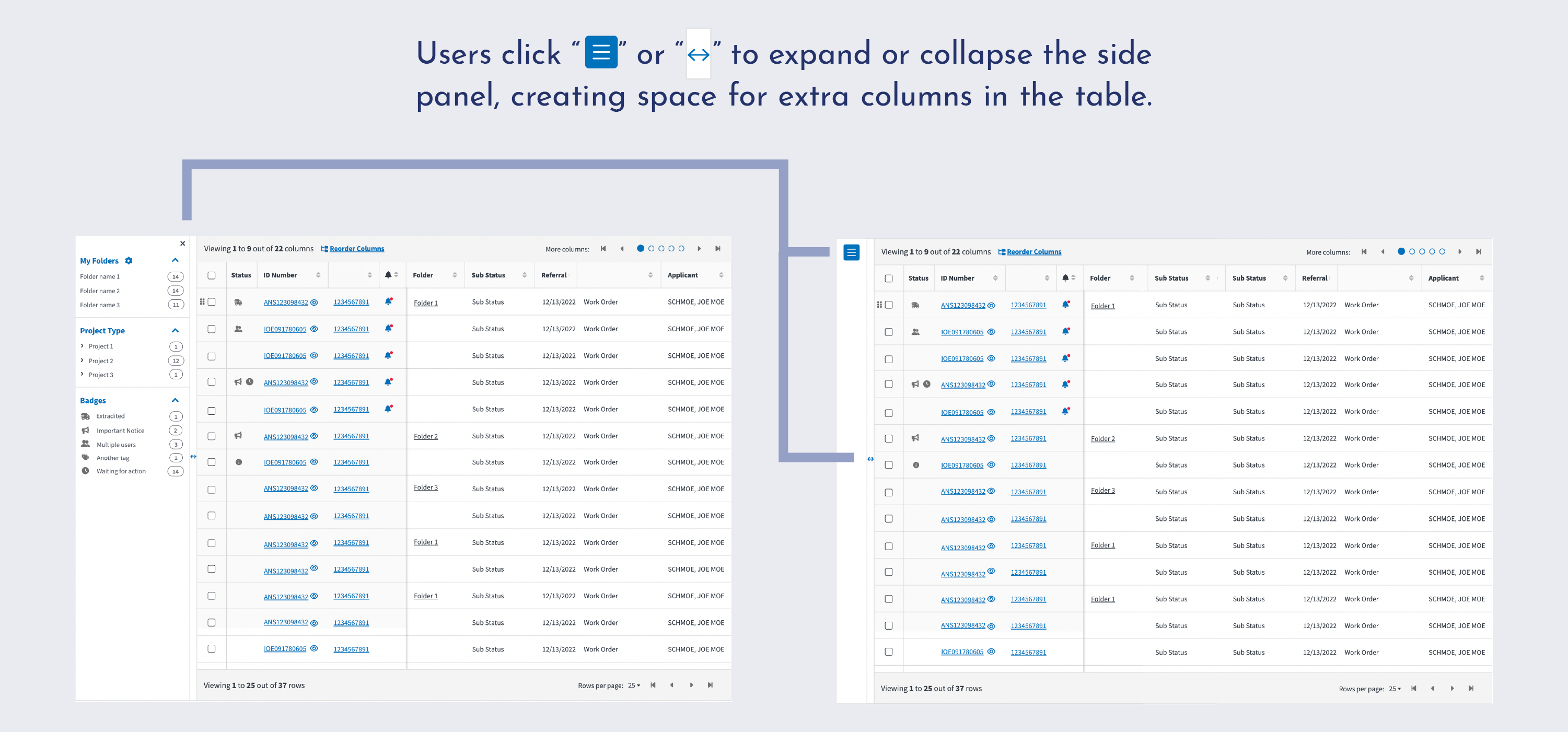
The new design needed to be responsive and spacious, while maintaining the same information density. To accomplish this, we made several improvements. First, we made the existing left side panel — a list of folders and filters to apply to the table — collapsible. This allows users to take advantage of precious horizontal space if they so choose.
The new design needed to be responsive and spacious, while maintaining the same information density. To accomplish this, we made several improvements. First, we made the existing left side panel — a list of folders and filters to apply to the table — collapsible. This allows users to take advantage of precious horizontal space if they so choose.
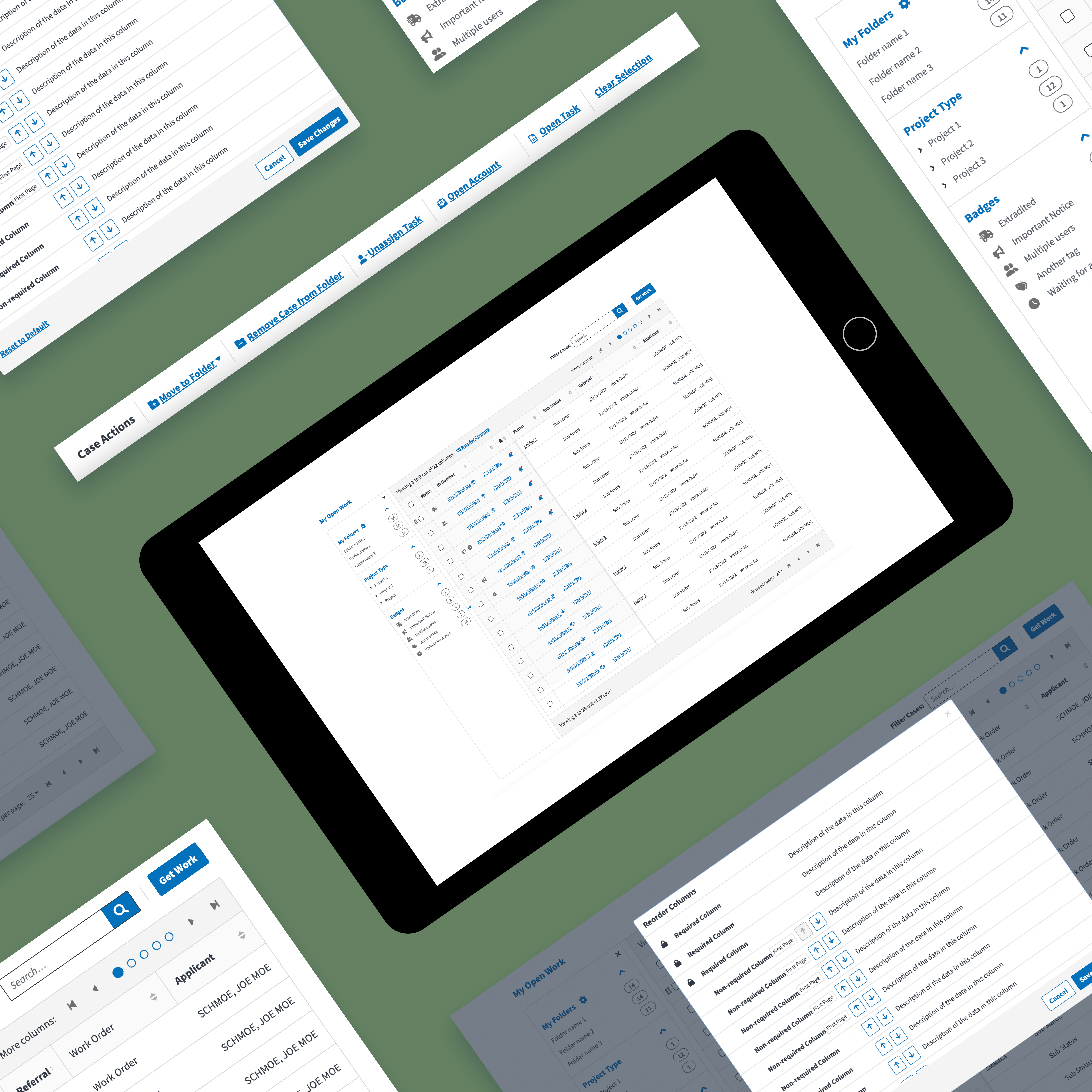
Second, we put in the work to make sure the table functioned at every relevant screen size. We mocked up designs for every breakpoint from large monitors to small tablets, based off of data collected from our users. Though mobile design was not within the scope for this project (as our users are generally not authorized and have no need to access the site on mobile devices), we think our enhancements would make mobile design feasible in the future if that need ever arises.
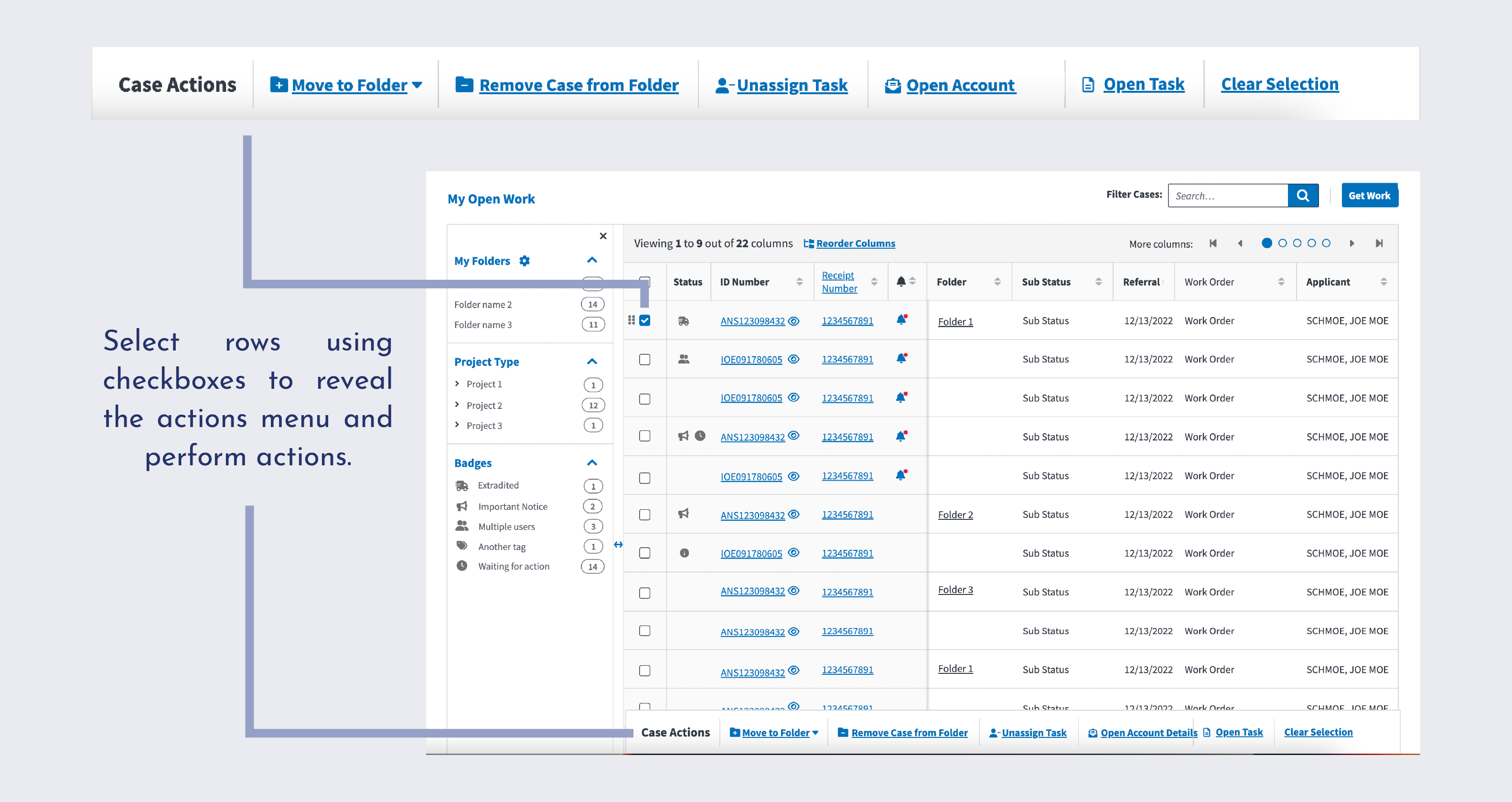
Finally, we consolidated row-based action items into a toolbar. In the previous design, actions were in a menu dropdown in a table column, in a folder column specific to folder actions, and a bulk actions button at the top of the table. In the new design, all actions are held within the toolbar, including bulk and folder actions. This cleans up the UI, consolidates functionality into the existing row checkboxes, and opens up avenues to scale the design to mobile sizes in the future.
The table pulls from a dataset with over 25 different data categories — all information that can help agents distinguish between cases, understand which cases are high-priority, and scan to determine their pertinent tasks. In the old design, the user used a drag-and-drop modal to choose which 7 columns to display at a time. If another category became relevant, the user needed to open the modal, find the right column, and axe one of the existing columns to make room in the table.
Tables are notoriously difficult to design responsively. In this case, information is hidden in order to keep the table at a reasonable size. But the page still isn't responsive — columns often overlap when the viewport sizes down.
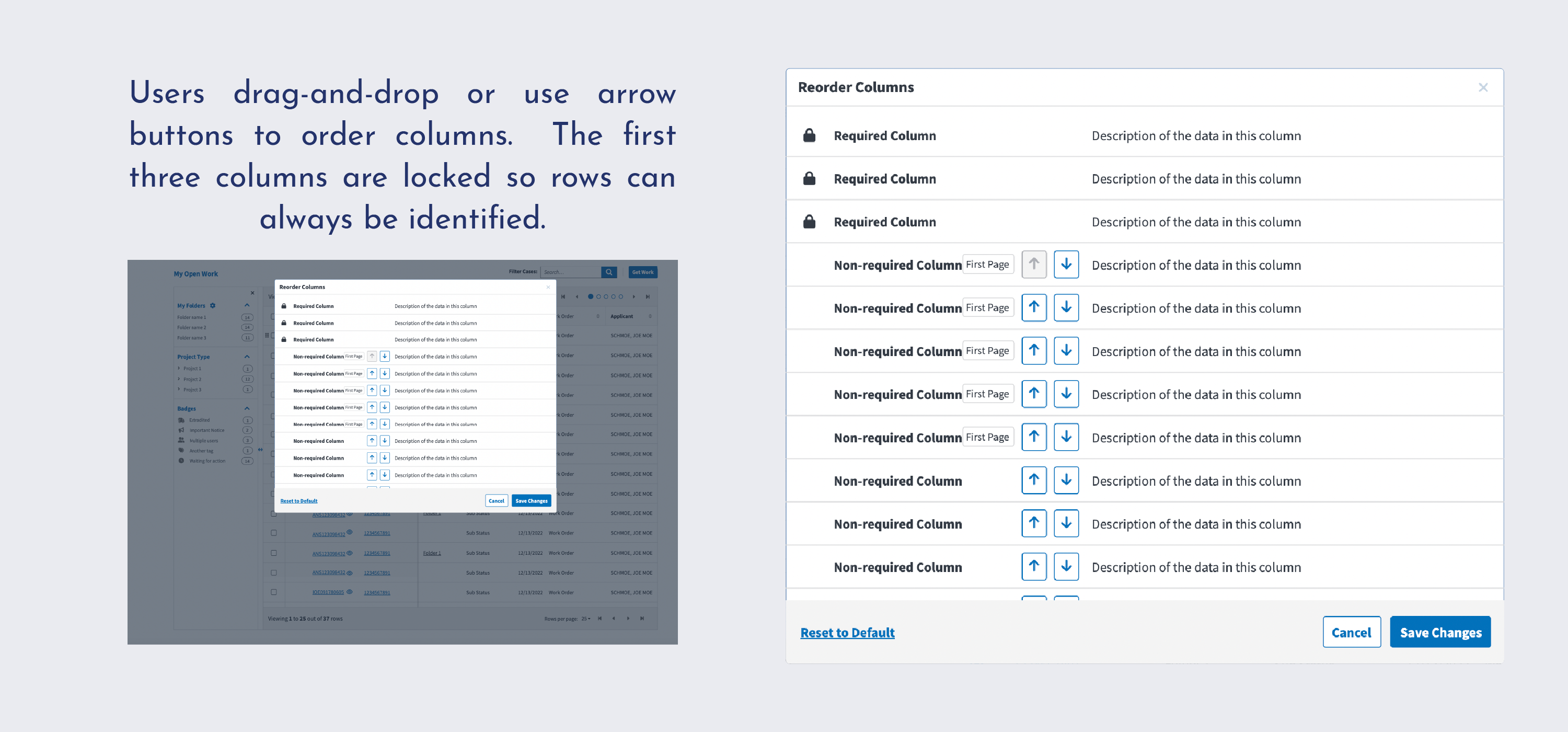
Users should not have to reload the homepage every time they want to see a piece of data hidden from the table. We changed the way columns are displayed in the table. Rather than have users choose which columns of data are loaded, we added table "pages" that allow users to page through all the data. To accomplish this, we needed to carefully design a new UI, since the tables have to have row pages as well. Some crucial columns are locked and always visible regardless of column page, including the control checkbox and user ID numbers. Users are able to determine the rank order of each column so they can customize their first page to suit their workflow. The ranking UI is as similar as possible to the old column-ranking flow to minimize confusion in the transition.
Users should not have to reload the homepage every time they want to see a piece of data hidden from the table. We changed the way columns are displayed in the table. Rather than have users choose which columns of data are loaded, we added table "pages" that allow users to page through all the data. To accomplish this, we needed to carefully design a new UI, since the tables have to have row pages as well. Some crucial columns are locked and always visible regardless of column page, including the control checkbox and user ID numbers. Users are able to determine the rank order of each column so they can customize their first page to suit their workflow. The ranking UI is as similar as possible to the old column-ranking flow to minimize confusion in the transition.
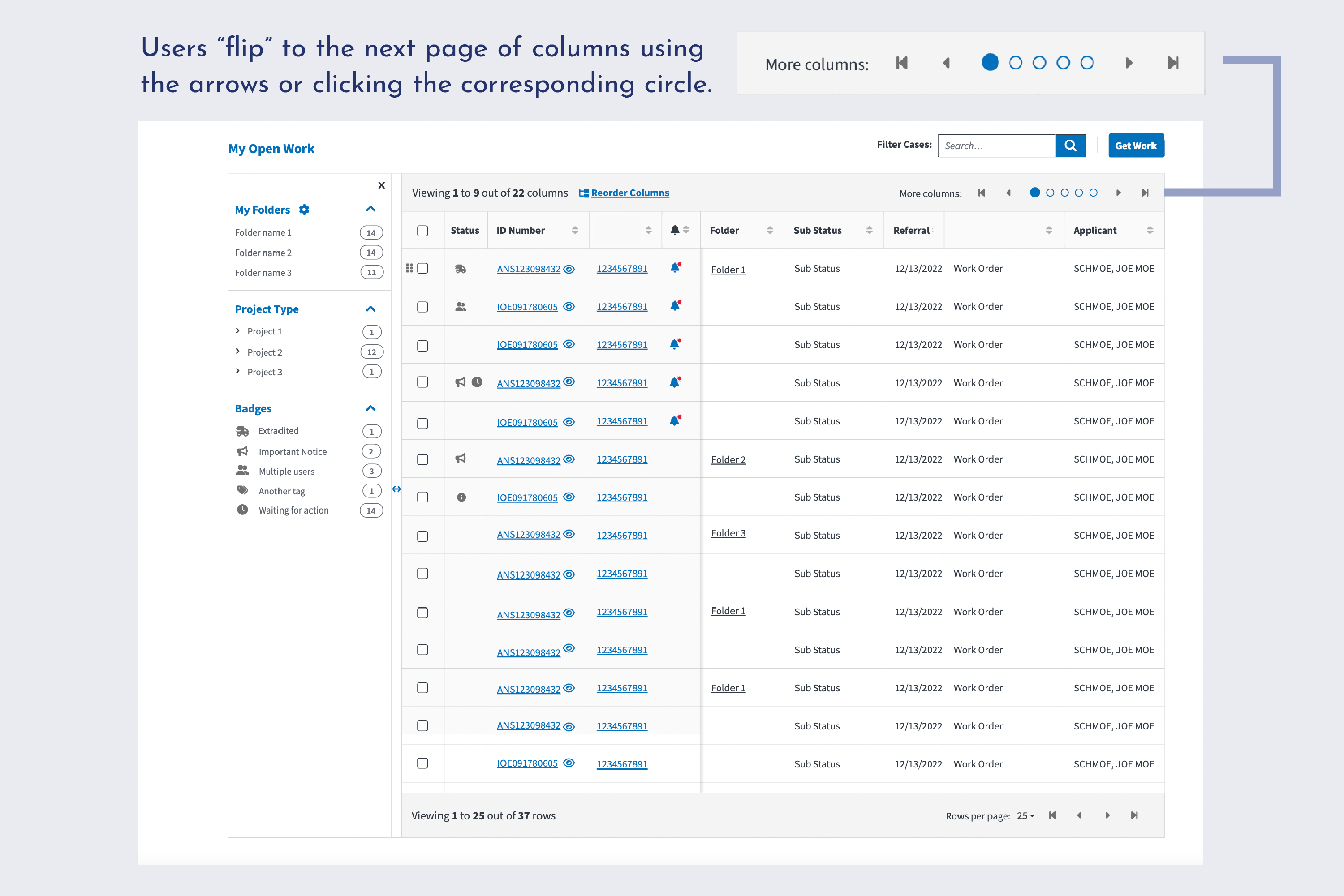
With these changes, the design now scales down easily to tablet sizes without resorting to hidden information. Rather than cram columns into a smaller space or hide even more information from the user, the table simply reduces the number of columns per page and increases the number of pages. Because users can rank columns according to importance, most users will never have to click through all the pages of columns.
With these changes, the design now scales down easily to tablet sizes without resorting to hidden information. Rather than cram columns into a smaller space or hide even more information from the user, the table simply reduces the number of columns per page and increases the number of pages. Because users can rank columns according to importance, most users will never have to click through all the pages of columns.
This project demonstrated the importance of mobile-friendly design from the get-go. We struggled to add responsiveness to the existing system, rather than enjoying a mobile-first design with responsiveness baked in. Even for something as complicated as this table, responsive design is possible. Leading the team through challenging iterations was very rewarding for me, and we reached our proposal only after much problem solving. We also had to keep flexibility at the top of our mind, as this homepage serves a wide range of users with all different workflows. Finally, the technical scope of the project was challenging, and pushed me to find creative solutions. We couldn't add load time to the plodding page, and could only enhance rather than redesign the page.
Though I transitioned to new clients in February 2023, this project is still underway. Next, our proposal needs to undergo usability testing to ensure the structural changes to the table work well for users. Then, development of the enhancements can begin. Future states of the design might include a separate table design specific to supervisors — their workflow differs greatly form most officers, and this current system is not geared towards their administrative and staffing duties. While our proposal greatly improves responsiveness, more drastic changes would need to be implemented to make this a truly mobile-friendly design.